Why simple websites usually perform better than overdesigned ones
Why simple websites usually perform better than overdesigned ones
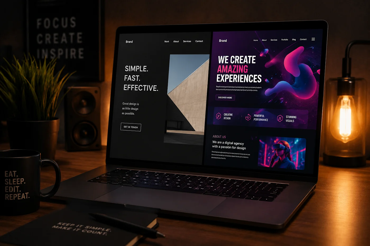
A lot of modern websites look incredible in screenshots.
Huge animations. Fancy transitions. Glass effects everywhere. Videos in every section. Floating elements moving in all directions.
And honestly, sometimes they really do look impressive.
But there is one problem.
Most people are not visiting a website to admire the design.
They came for a reason.
Maybe they want to:
buy something
contact a business
book a service
read information
check pricing
or simply understand what the company actually does
And this is exactly where many websites fail.
Too much design creates friction
One of the biggest mistakes I see is when design starts fighting against usability.
The page becomes visually busy:
too many animations
oversized sections
massive spacing
unclear navigation
unnecessary effects
text hidden behind visual tricks
important buttons lost inside the layout
The result is simple.
People leave.
Not because the website looks bad, but because using it feels tiring.
Good websites should feel effortless.
The visitor should instantly understand:
where they are
what the business does
what action they should take next
If someone has to “figure out” your website, you already lost attention.
Fast websites usually convert better
Performance is another huge factor people underestimate.
A website can look amazing on a powerful desktop computer with fast internet.
But real users are often browsing:
on mobile
on weaker devices
on slower internet
while multitasking
during short attention spans
If your homepage takes several seconds to fully load because of giant videos, heavy animations, and unnecessary effects, many visitors will leave before they even see the content.
Simple websites are often:
faster
cleaner
easier to navigate
easier to understand
And that directly affects conversion.
Simplicity feels more professional
This is something many businesses misunderstand.
They think “more design” automatically means “more premium.”
Usually the opposite happens.
Overdesigned websites often start feeling:
chaotic
outdated very quickly
hard to use
visually exhausting
Meanwhile, simple layouts tend to age much better.
Clean typography, strong spacing, clear structure, and focused visuals usually create a far more professional feeling than trying to impress visitors with constant motion and effects.
Good design is often invisible.
It guides people naturally without forcing attention everywhere.
A website is a business tool first
This is probably the most important part.
A website is not only art.
It is a tool.
Its job is usually to:
generate leads
build trust
explain services
sell products
support branding
help communication
And if design starts hurting those goals, then the design is no longer helping the business.
Of course, creative industries can push visuals much further. Cinematic portfolios, fashion brands, creative studios, and experimental landing pages have more freedom.
But even there, structure and clarity still matter.
Because at the end of the day, people still need to navigate the site comfortably.
Final thoughts
I still love good design.
Animations, cinematic visuals, modern interfaces, and strong branding absolutely matter.
But the best websites usually know when to stop.
They focus on clarity first, then enhance the experience carefully instead of overwhelming the visitor.
And honestly, that balance is much harder to achieve than simply adding more effects.